


Here’s a peek at five trends we expect to define screen design this year.
Our list might not be completely accurate or exhaustive, but predicting trends is a fun and provocative way to kick off the year. And, of course, we can all share a laugh same time next year.

1. Mobile is the king
The hard data is in. Mobile and tablet are about to the take primacy over the desktop. Even the slowest of the corporations are forced to shift focus away from IE optimizations towards providing a great mobile experience (simple resizing and stacking of content is only the first step). A welcome relief for everyone.
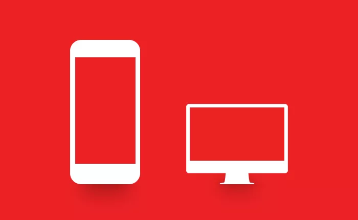
Webs are for devices.
2. Simplicity and minimalism, on the surface
Mobile-first and progressive enhancement approach saw websites become visually simpler to allow for greater adaptability, and we’ll see the continuation of this trend in the year to come. At the same time, more effort will be invested into making sites feel native on any device and augmenting designs with animated content (preferably SVG animation) and complex interaction patterns (preferably not only parallax scrolling).
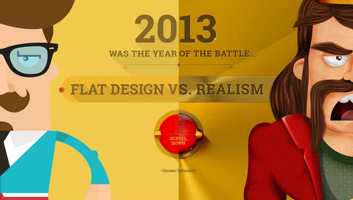
Flat design won in 2013.
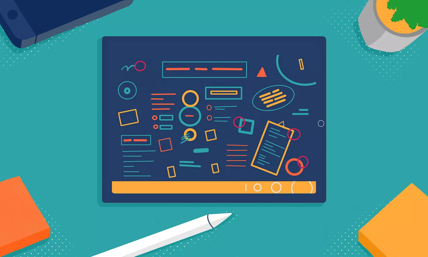
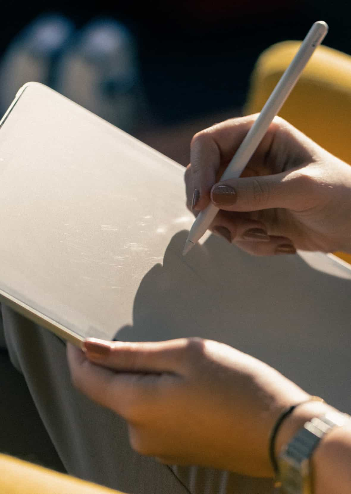
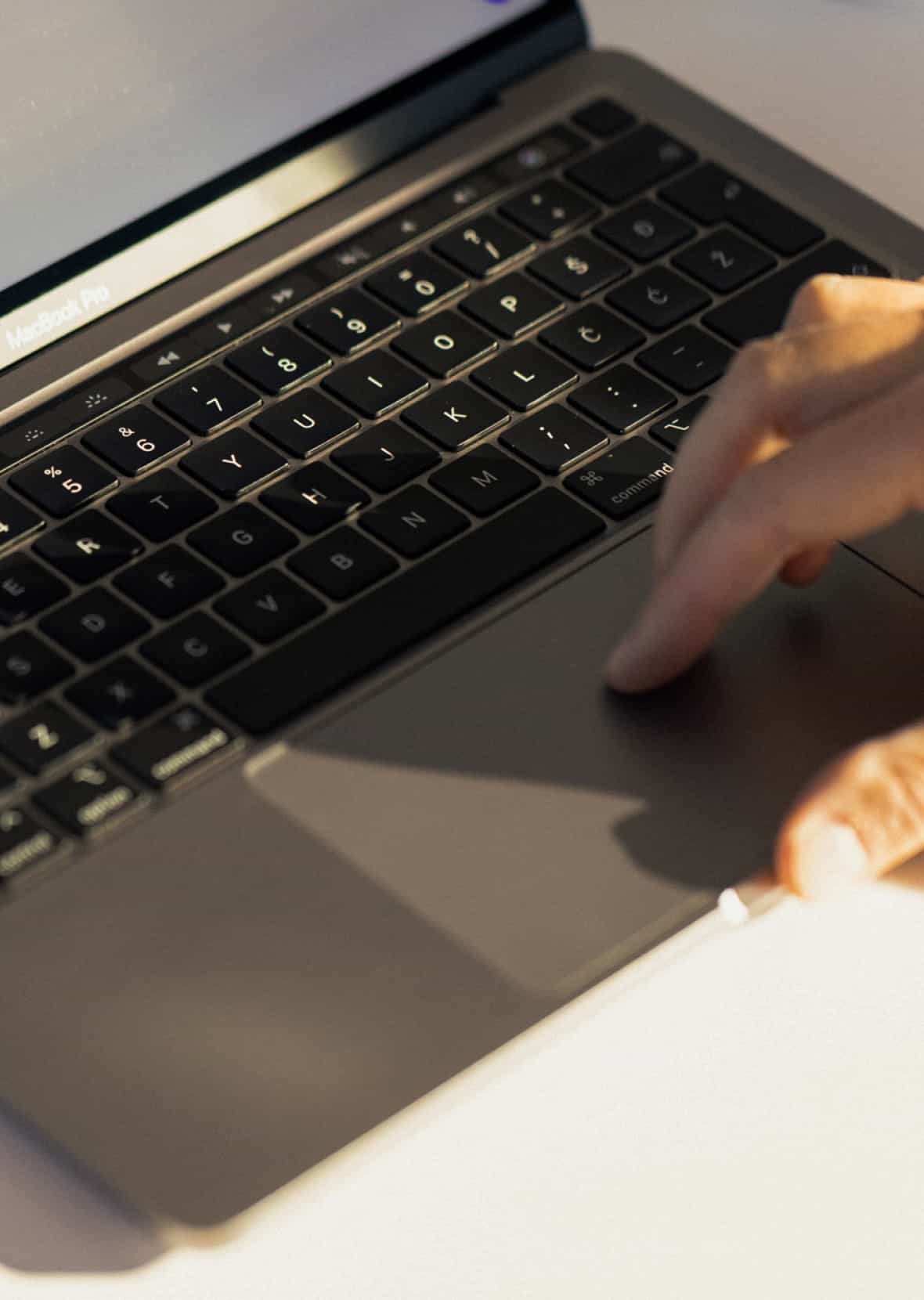
3. Tools
Currently, there is a gap between what web designers need and what the available design software offers. While Adobe has been catching up with the new trends, new software seems to underdeliver in the end, and the traditional palette of products seems slow and cumbersome in designing complex interfaces. In the same vein, while newcomers, like our favorite Sketch, are more in tune with the current design demands, they seem to have much catching up to do with the established design tools. We expect the situation to clear up in 2014.

Switching to Sketch?
4. Retina optimization
Retina optimization may still be considered a non-essential feature for the web, if not downright a misdirection of resources and a waste of bandwidth. But not for long. A surging number of mobile users will exert pressure to offer a retina-crisp web experience, even with the current low number of desktop users sporting high-DPI displays. SVG and font icons will continue flourishing. Don’t get caught blurry-handed with a low-res logotype or favicon.
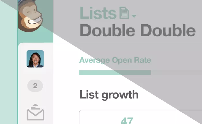
Mail Chimp looks great on Retina.
5. Desktop inherits mobile patterns
We’ll see a welcome influx of UX ideas coming from the world of mobile applications. While sometimes unnecessary, awkward or plain irritating, ideas will continue to adapt, evolve and mature as a necessary result of the two worlds coming together. Get used to seeing even more drawer menus on the web, but being used in a smarter way.
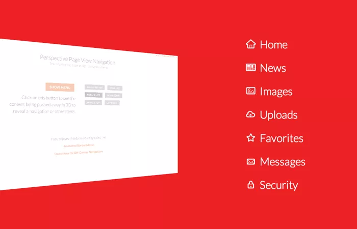
Codrops pushes the limits of everyday web experience.